Craftsman Bungalow Exterior Colors — Authentic Palettes That Work
Craftsman bungalow exterior colors have gotten complicated with all the modern paint marketing noise flying around — and almost none of it has anything to do with Arts and Crafts principles. I know this firsthand. As someone who has restored three craftsman homes over fourteen years — a 1911 bungalow in Portland, a 1923 California bungalow in Pasadena, a 1917 four-square in Milwaukee — I learned everything there is to know about exterior color decisions the hard way. Standing in a paint store holding seventeen sample chips, realizing you have no idea what you’re looking for — that’s a real experience. I’ve had it multiple times. The wrong color choices on these houses are visible, they feel permanent, and they’re surprisingly easy to make.
What I eventually figured out, mostly through expensive mistakes, is that authentic craftsman palettes follow an actual logic. Understand the logic and the choices get cleaner. Don’t understand it and you’ll repaint in three years. Ask me how I know.
The Craftsman Exterior Color Philosophy
The Arts and Crafts movement — the thing that gave birth to the craftsman bungalow — was a direct reaction against Victorian excess. Gaudy polychrome color schemes, industrial production, ornament for ornament’s sake. Gustav Stickley, the Greene brothers, and the designers who shaped this aesthetic were obsessed with honest materials and natural forms. That obsession extended straight to exterior color.
The guiding principle was blunt: a craftsman home should look like it grew out of its site. Colors were pulled from the surrounding landscape — bark brown, lichen green, dried-grass ochre, clay-soil red. This wasn’t romanticism. It was a deliberate design statement. The house belongs to its land. It doesn’t impose on it.
But what is a craftsman earth tone, exactly? In essence, it’s a complex, slightly grayed-down color that suggests how natural materials actually look — which is rarely a single clean hue. But it’s much more than that. A craftsman brown has green in it. A craftsman green has brown in it. These colors were mixed to reflect the layered quality of real bark, real stone, real lichen. “Earth tones” as a category is too broad to be useful. The specific quality of these particular earth tones is what matters.
The Three-Color System
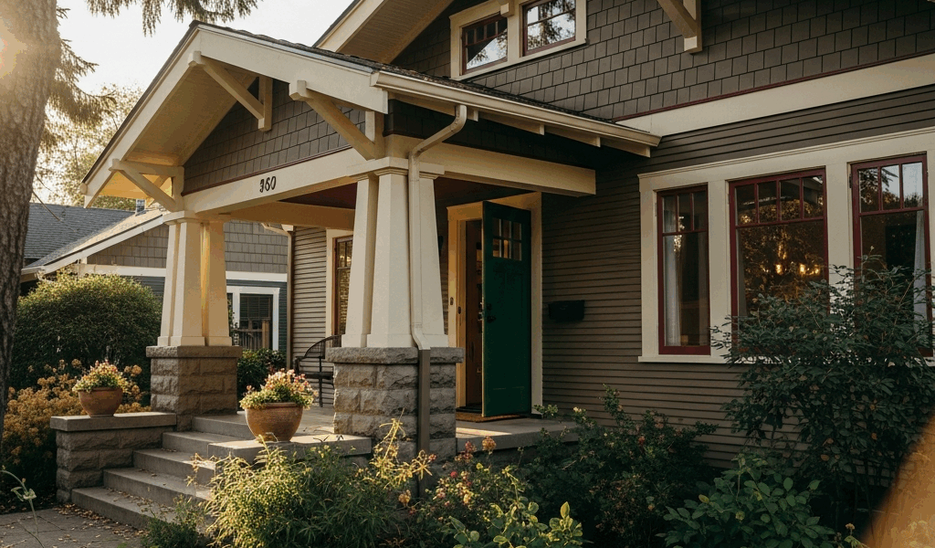
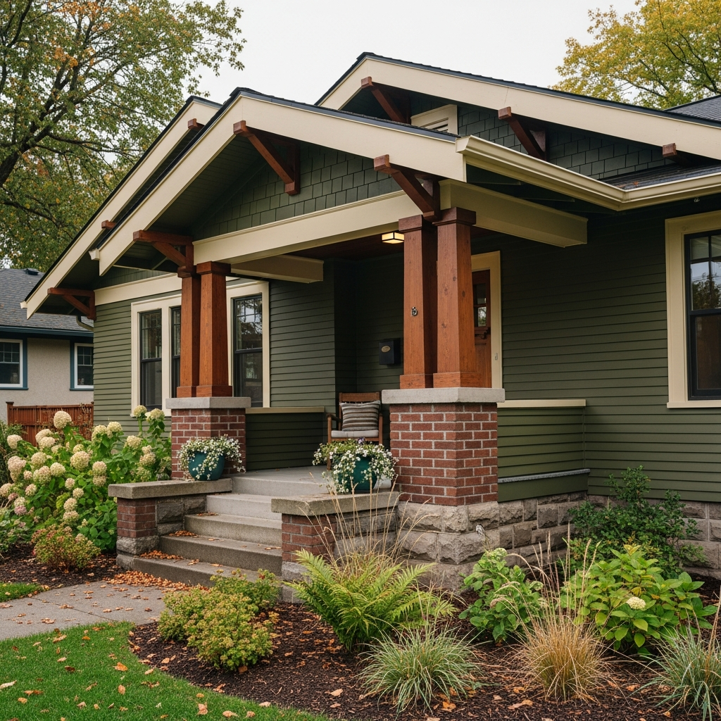
Original craftsman exteriors almost always used three distinct color zones. The body color — main siding or shingles — was typically the darkest or most saturated element. Trim color, applied to fascia boards, window casings, and corner boards, was either a lighter value of the body or a warm neutral that pulled out the body’s undertones. The accent color showed up on the front door, porch columns, and decorative brackets.
This is the opposite of how most people approach exterior painting today. Modern convention puts the lightest color on the trim and keeps the body mid-range. On authentic craftsman homes, the visual weight sits in the body. Trim articulates structure — it doesn’t lighten it.
Porch details deserve special attention here. Craftsman porches are architectural features, not afterthoughts. The colors on porch columns, exposed rafter tails, and decorative knee braces need to relate to body and trim in a way that reads as intentional. I’ve seen too many restored craftsmen where someone painted everything the same color to avoid making the decision. It flattens all the detail work. All that beautiful joinery and it just disappears.
How Natural Materials Inform the Palette
Stone foundations, brick chimneys, wood shingle roofs — many craftsman homes have these already, and they’re your first color constraint. They’re also a gift. Pick up an actual stone from your foundation and carry it into the paint store. The colors in that stone — warm grays, tans, ochres, maybe some rust — are your starting point. Your paint palette should feel like an extension of those materials, not a contrast.
Roofing matters enormously here, and this is something I got badly wrong on the Portland house. I chose body and trim colors I loved in isolation, then realized they fought against the cedar shake roof I’d just paid $18,000 to replace. The shakes had orange-red undertones that made my chosen gray-green body look genuinely sickly. I repainted. Don’t make my mistake — figure out your roof undertones before you buy a single gallon.
5 Authentic Exterior Color Combinations
Probably should have opened with this section, honestly. These are combinations I’ve either used myself or watched work beautifully on well-preserved or carefully restored craftsman homes. Where I can, I’m giving you specific paint color names — “warm brown” is useless information.
Combination 1 — Olive Body with Brown Trim and Brick Red Accent
This is the combination most people picture when they think craftsman bungalow. It’s earned its place. Benjamin Moore Avocado (2145-10) for the body — a deep, complex olive that reads differently in morning light than afternoon light. Pair it with Woodstock Tan (HC-13) for trim, which pulls the warm undertones forward without going full brown. Accent on the door, brackets, and porch column bases in Paprika (2009-10) provides punch without screaming. This combination works best when you have existing masonry — stone or brick in the warm tan-to-red range ties everything together.
Combination 2 — Warm Taupe Body with Forest Green Trim and Mustard Accent
This reads as a California craftsman combination, partly because the Gamble House in Pasadena — 1908, Greene and Greene — uses a variation of this palette. Farrow & Ball Dead Salmon (No. 28) sounds completely wrong but functions beautifully as a warm taupe body on craftsman shingles. Enough gray to stay sophisticated, enough pink-tan to stay warm. Trim in Mizzle (No. 266), a complex sage-green, creates genuine contrast without fighting. The door in something close to Benjamin Moore Hawthorne Yellow (HC-4) reads as golden mustard in most light. That’s what makes this combination endearing to craftsman enthusiasts — it’s unexpected and completely period-correct at the same time.
Combination 3 — Deep Brown Body with Cream Trim and Sage Accent
Straightforward. Almost impossible to get wrong. Benjamin Moore Chocolate Fondue (2107-20) for the body gives you that dark, grounded look of original craftsman paint — early oil-based paints darkened with age, and craftsman homes in historic photos often read very dark. Navajo White (OC-95) for trim runs warmer than pure white and won’t look harsh against the deep body. Sage green — Sherwin-Williams Sage (SW 0023) — on accent elements ties back to natural materials without competing.
I used a close variant of this on the Milwaukee house. The deep brown reads almost black in overcast light — and in a Midwest winter, overcast is most of your light. Factor that in before you commit.
Combination 4 — Slate Blue-Gray Body with Dark Olive Trim and Burgundy Accent
Less common but historically accurate. Slate and blue-gray shingles appear regularly on Pacific Northwest craftsman homes where the palette naturally pulls cooler. Sherwin-Williams Pewter Cast (SW 7673) for the body — a blue-gray with just enough complexity to avoid looking like a mistake. Trim in Benjamin Moore Dried Thyme (HC-179) is an olive so dark it reads almost black in shade, which grounds the cooler body without fighting it. Accent in Cabernet (2116-20) on the front door — a deep burgundy that ties back to craftsman interior colors and feels genuinely period-correct.
Combination 5 — Ochre Body with Deep Brown Trim and Forest Green Accent
Inspired by the warm stucco-and-shingle combinations on Pasadena bungalows. The ochre body — Benjamin Moore Goldtone (2152-40) is a reasonable starting point, though you may want to push it a shade darker — reads like warm clay in afternoon sun. Deep brown trim in Chocolate Mousse (2107-30) outlines structural elements crisply. Forest green in Farrow & Ball Calke Green (No. 80) on the door and any decorative metalwork pulls the whole thing toward the landscape. Strong afternoon sun is where this one really earns its place.
Colors to Avoid on a Craftsman Home
This section might be more useful than the previous one. The wrong colors on a craftsman home are immediately visible in a way that’s hard to explain and easy to feel — the house just looks uncomfortable, like it’s wearing someone else’s clothes.
The Modern Gray Trend
Cool grays are everywhere right now. Agreeable Gray, Repose Gray, Mindful Gray — bestselling exterior colors in the country, every one of them. Every single one of them also looks wrong on a craftsman home. Not a little wrong. Completely wrong.
Craftsman architecture is warm — exposed wood, natural materials, handcraft aesthetic. Cool gray fights every one of these qualities. It makes wood trim look washed out, disconnects the house from its site, and gives the whole structure a sterile, renovation-era quality that the Arts and Crafts movement was specifically built to reject.
If you want gray on a craftsman, use a gray with warmth in it. There’s a real difference between a gray with yellow-brown undertones and one with blue undertones. Warm-gray territory is legitimately craftsman-appropriate. The cool-gray trend is not.
Bright or Pure Colors
Saturated, bright colors belong on Victorians. Craftsman colors are never pure. A craftsman red has brown in it. A craftsman blue has gray in it. A craftsman green has both. Hold a paint chip up to the light — if it looks vivid and clean, it’s probably wrong for this style.
I’ve seen craftsman bungalows painted in bright colonial blue with white trim. It creates architectural confusion — the house looks like it’s trying to be two different things at once. The deep rooflines, the wide overhangs, the heavy porch columns all need colors that complement their visual weight, not fight it with lightness and brightness.
White Trim
Pure white trim is a colonial detail — Federal-style homes, Cape Cods, Greek Revivals. On a craftsman home, bright white trim creates harsh contrast and pulls the eye away from the beautiful structural details instead of helping them read clearly. Warm whites, creams, and tans — yes. Benjamin Moore White Dove (OC-17) is about as white as you should go on craftsman trim, and even then only in warm climates with strong sun that softens everything down.
Trendy Dark Exteriors Applied Wrong
Dark exterior colors are having a moment, and I want to be careful here — craftsman homes can legitimately be very dark. The distinction is in the undertones and application. A dark color that’s essentially charcoal gray — Sherwin-Williams Iron Ore has been applied to a lot of craftsman bungalows recently — can work if the trim is warm and the accent color is earthy. The mistake is painting everything one very dark neutral and eliminating the three-zone color logic entirely. That’s not craftsman. That’s a renovation-era choice sitting on a craftsman house.
How to Choose Based on Your Region and Climate
Light is everything in exterior color. The same paint chip looks completely different in Portland versus Pasadena versus Milwaukee — I know this directly, having repainted in all three places. The light in each location essentially transforms the color you chose in the store.
Pacific Northwest
Overcast skies dominate much of the year in Seattle, Portland, and surrounding areas. Diffuse gray light flattens colors and pulls out cool undertones. What looks like a warm olive green on a sunny day reads as flat and dingy on an overcast November afternoon — and November afternoons are most of what you get.
Go warmer than your instinct says to. Colors that seem slightly orange or brown in the store will read correctly in the field. The deep brown body combination (Combination 3) performs extremely well here — the depth of the dark brown actually benefits from overcast light, looking rich rather than heavy. Avoid anything with significant blue or gray in it, or commit fully to the slate-blue combination (Combination 4) and use the warmest possible trim to compensate.
Cedar shingles are extremely common on Pacific Northwest craftsman homes — they weather to a silver-gray over time. If you have unpainted shingles that have weathered, that silver-gray tone is actually a legitimate craftsman color. Consider working with it rather than against it.
Southern California
Strong, flat, high-UV light in Southern California does something specific to exterior paint: it washes out subtle variation and pushes colors toward their base hue. A color with complex undertones in low light can look flat and simple at Pasadena noon.
This means you can go more complex in Southern California and still have that complexity read. The Pasadena bungalow neighborhoods support richer, more layered combinations — ochre bodies, deep forest green trim, warm terracotta accents. Strong light reveals rather than obscures in this climate.
UV bleaching is also a real factor here. Darker colors show bleaching faster, and modern latex doesn’t resist it as well as the original oil-based paints on these houses. Sherwin-Williams Duration and Benjamin Moore Aura Exterior both offer strong UV resistance — worth the extra cost. Plan on a 7-8 year repaint cycle, not the 10-12 years sometimes quoted.
Midwest
Midwest light is variable in a way that neither the Pacific Northwest nor California prepares you for. Strong directional sun on summer afternoons. Low, flat, gray-for-weeks light in winter. You need colors that hold their character across both extremes.
Deep, saturated colors help — not bright, but rich. Dark brown, deep olive, warm taupe — these hold up across summer sun and winter gray. Very light colors tend to wash out in summer and go flat in winter. The deep brown with cream trim combination was what I landed on for the Milwaukee house, and it remains one of the choices I’m most confident in after living with it through two winters.
Freeze-thaw cycles also affect paint adhesion in ways warmer climates don’t prepare you for. Proper surface preparation — stripping failed paint rather than painting over it — matters more in cold-climate applications. I skipped this on one wall of the Milwaukee house and regretted it completely within eighteen months. Budget for the prep time. That’s where the money actually goes.
Taking Samples Seriously
Frustrated by watching a $340 gallon of exterior paint look completely different on the house than it did on the chip, I started testing every color using 12-inch by 12-inch painted foam board samples before committing to anything. Hold them against the house at different times of day — early morning, noon, late afternoon. Look at them in overcast light and direct sun. The way a color behaves in your specific conditions is information no paint chip can give you.
Buy sample quarts. They cost about $7-9 each. They will save you significant money and significant regret. This new habit took hold after my second expensive repaint and has since evolved into the non-negotiable first step that anyone working on period homes should know and follow. Where you live genuinely changes what you’ll see when you put that sample on the wall — which is why this piece of advice belongs here, at the end of the regional section, rather than anywhere else.
The craftsman bungalow is one of the most cohesive American architectural styles ever developed. The color philosophy that came with it isn’t restrictive — it’s generative. Internalize the earth-tone logic, the three-zone system, and the way natural materials anchor the palette, and you stop fighting the house. You start working with it. That’s when the right color stops being overwhelming and starts being obvious.

Stay in the loop
Get the latest classic architecture today updates delivered to your inbox.