You’re standing in front of your Craftsman bungalow with a paint fan deck and absolutely no idea which colors are right. The house deserves something historically grounded, not another gray-and-white flip job that strips away its character. The Arts and Crafts movement had a specific color philosophy, and once you understand it, the choices become surprisingly clear.
The Arts and Crafts Color Philosophy
The Arts and Crafts movement (roughly 1880 to 1920) was a direct rebellion against industrial mass production. William Morris and his contemporaries wanted homes that looked like they belonged to the landscape, not like they were assembled from factory parts. That philosophy extended all the way down to paint color: every hue in the Arts and Crafts palette comes from nature. Earth tones, forest colors, stone grays, clay reds, harvest golds. Nothing synthetic-looking. Nothing that shouts.
This wasn’t arbitrary taste — it was ideology. Honest materials, natural beauty, harmony between the built environment and the land it sits on. When you pick colors from this palette, you’re not just painting a house. You’re preserving the design intent that made it worth building in the first place.
Exterior Color Palette — The Authentic Combinations
An Arts and Crafts exterior uses three color zones: body, trim, and accents. Getting the relationship between these three right matters more than any individual color choice.
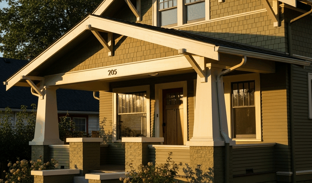
Body colors: Think warm, grounded, and muted. Olive green (Sherwin-Williams Relentless Olive or Benjamin Moore Dried Basil), warm brown (SW Steady Brown or BM Woodcliff Lake), deep gold (SW Grandiose or BM Gilded), terra cotta (SW Roycroft Adobe or BM Cinnamon), muted sage (SW Sage Green Light or BM Kennebunkport Green). These aren’t bright colors. They’re the colors of bark, stone, dried grass, and weathered clay.
Trim colors: Always a lighter, warmer version of the body — never bright white. Cream (BM Linen White or SW Creamy), warm tan (SW Accessible Beige), antique white (BM White Dove). Bright white trim against an earth-toned body looks jarring and historically wrong. The contrast should be gentle, not sharp.
Accent colors: Doors, shutters, window sashes, decorative brackets. Deep red-brown (SW Fireweed or BM Cottage Red), forest green (SW Roycroft Bottle Green), or dark charcoal brown. The accent is the darkest element and appears in the smallest quantity.
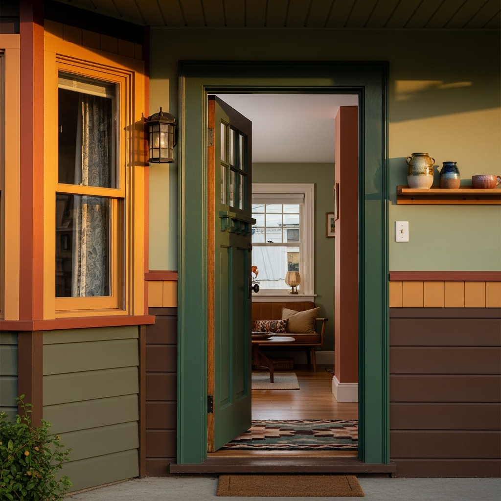
Interior Color Palette — Room by Room
Arts and Crafts interiors ran deeper and richer than the pastels that dominated the colonial revival but avoided the heavy darkness of late Victorian rooms. The palette shifts by room function:
Living rooms: Warm greens (BM Georgian Green, SW Artichoke) and rich golds (BM Grenada Villa, SW Antiquity). These colors work with the warm wood tones of oak trim and built-in bookcases that define Craftsman living spaces. The fireplace wall can go a shade deeper — a darker olive or warm brown — to anchor the room.
Dining rooms: Deeper, warmer tones. Terra cotta (BM Audubon Russet), warm brown (SW Brevity Brown), or deep pumpkin (BM Masada). Dining rooms in Arts and Crafts homes were designed to feel intimate and warm under lamplight, and these colors deliver that effect. The plate rail and wainscoting below it are typically stained wood or painted a warm cream.
Bedrooms: More restful and muted. Soft sage (BM Louisburg Green), pale gold (SW Compatible Cream), dusty blue-green (BM Wythe Blue — used sparingly, as the Arts and Crafts palette leans warm). Bedrooms are the one place where lighter values are historically appropriate.
Woodwork throughout: Quarter-sawn oak with a warm amber stain is the gold standard. If your woodwork is painted, warm cream or a slightly tinted off-white is period-appropriate. Never bright white on interior woodwork in an Arts and Crafts home.
Colors to Avoid — What Breaks the Aesthetic
Bright white: On trim, on walls, on anything. Pure white didn’t exist in the Arts and Crafts vocabulary. It reads as sterile and modern against the warm tones and natural materials these homes are built from.
Pastels: Baby blue, lavender, mint green, blush pink — these belong to a completely different architectural tradition. Using them on a Craftsman home is like putting chrome wheels on a Model T.
Cool grays: The entire modern gray trend (Repose Gray, Agreeable Gray, etc.) clashes with Arts and Crafts architecture. These homes are built on warm undertones — warm wood, warm stone, warm light. Cool gray kills that warmth instantly.
Trendy accent colors: Navy blue doors, black window frames, dark charcoal exteriors. These are contemporary design trends that have nothing to do with the Arts and Crafts period. They’ll date your home to the 2020s, not the 1910s.
The Three-Color Rule — Putting It Together
Every successful Arts and Crafts exterior uses exactly three colors: body, trim, and accent. Here are three proven combinations with specific paint names:
Combination 1 — Classic Olive: Body: SW Relentless Olive. Trim: BM Linen White. Accent (door/shutters): SW Roycroft Bottle Green. This is the quintessential Craftsman palette — warm, grounded, and immediately recognizable as period-appropriate.
Combination 2 — Warm Earth: Body: BM Woodcliff Lake (warm brown). Trim: SW Creamy. Accent: BM Cottage Red. Works exceptionally well on stucco or shingle-style Craftsman homes. The red accent adds life without straying from the natural palette.
Combination 3 — Golden Craftsman: Body: SW Grandiose (deep gold). Trim: BM White Dove. Accent: SW Steady Brown. This combination looks particularly good on clapboard siding and highlights the horizontal lines that Craftsman architects emphasized.
Whichever combination you choose, test the colors in natural light on the actual house before committing. Paint swatches look dramatically different on a fan deck than they do on a textured exterior surface at 3 PM. Buy sample pots, paint a 2-foot square on each surface (body, trim, accent location), and live with it for a few days across different lighting conditions.

Stay in the loop
Get the latest classic architecture today updates delivered to your inbox.