You’re renovating a Craftsman kitchen or building a new one that needs to feel right for the house, and every Pinterest board you’ve seen is full of modern farmhouse kitchens dressed up with shiplap and Edison bulbs pretending to be vintage. That’s not what a 1920s Craftsman kitchen looked like. Here’s what was actually in these kitchens and how to recreate the aesthetic with materials you can buy today.
What a 1920s Craftsman Kitchen Actually Looked Like
The 1920s kitchen was a working room, designed for efficiency by women who spent real hours in it every day. The layout was compact and organized around workflow, not entertaining.
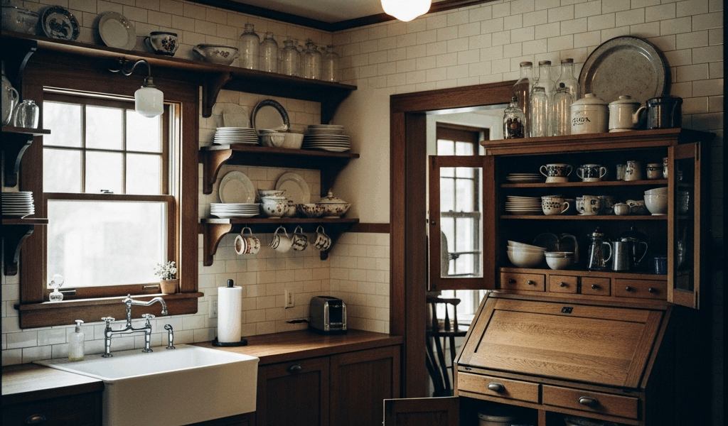
Open shelving with plate rails — upper storage was visible, organized, and functional. Dishes sat on shelves with a rail at the front to keep them from sliding off. The aesthetic was deliberate: you could see what you had and reach it without opening a cabinet door.
The Hoosier cabinet — a freestanding all-in-one workstation that combined a flour sifter, spice rack, pull-out work surface, and storage into a single piece of furniture. If the kitchen didn’t have a Hoosier, it had a built-in hutch or pantry cabinet that served the same purpose. These were the predecessors of modern fitted kitchens.
White subway tile — specifically 3×6 field tile with dark grout, typically gray or charcoal. Not white grout (that’s a modern choice), and not colored grout (that came later). The dark grout line against white tile created a clean geometric grid that matched the architectural detailing in the rest of the house.
Beadboard wainscoting — running from the floor to about 36 inches up the wall, painted white or cream. Above the wainscoting, walls were painted in warm tones or covered in a simple pattern wallpaper.
Linoleum floors — the original linoleum, made from linseed oil and natural materials (not the vinyl sheets sold as “linoleum” today). Black and white checkerboard was common but not universal. Solid colors in warm tones were equally popular. Marmoleum is the modern equivalent made from the same natural materials.
Enameled cast iron sink — deep, heavy, and built to last decades. Usually white, mounted in or under a wooden counter. The farmhouse apron-front style was standard, not a design choice — that’s just how sinks were made.
Cabinets — The Craftsman Style Done Right
Craftsman kitchen cabinets are defined by what they’re not: they’re not ornate, they’re not glossy, and they’re not designed to make a statement. They’re functional storage with clean lines and honest construction.
Door style: Flat-panel (recessed center panel with a simple frame) or very simple raised panel. No cathedral arches, no elaborate frame profiles, no decorative routing. The door should look like it was made by a skilled carpenter, not stamped out by a machine trying to look fancy.
Hardware: Simple bin pulls (also called cup pulls) and small knobs in oil-rubbed bronze, black iron, or aged brass. The hardware is understated — it’s there to open the door, not to decorate it. Avoid anything with ornate backplates, crystal knobs, or contemporary bar pulls.
Color: Painted white or cream was the dominant choice in the 1920s — not natural wood, which became popular in later decades. If you want exposed wood, it should be quarter-sawn oak with a warm amber stain, consistent with the trim throughout the rest of the house.
Upper cabinets with glass fronts: Some upper cabinets featured glass panel doors, typically with a simple divided-light pattern matching the home’s windows. These provided visible storage for everyday dishware — consistent with the open shelving philosophy.
What to avoid: Shaker-style cabinets with a contrasting island color (that’s modern farmhouse, not Craftsman), chrome or nickel hardware, soft-close drawer slides visible from the front, and any cabinet door with a profile that’s trying too hard.
Backsplash and Tile — Period-Accurate Choices
Standard: White subway tile in the classic 3×6 format with dark grout. This is the safest, most historically accurate backsplash choice. The tile should be flat or have a very slight bevel — the heavily beveled “handmade” look sold at modern tile shops is actually more contemporary than authentic.
Premium option: Arts and Crafts tile — handmade field tile with a matte or satin glaze in warm, slightly irregular tones. Companies like Motawi Tileworks, Pewabic Pottery, and Tile Heritage produce tiles directly inspired by the Arts and Crafts tradition. Use these as a feature area (behind the range or sink) with standard subway tile filling the rest of the backsplash.
Avoid: Large-format tile (12×24 or bigger), marble, glass mosaic, any tile with a glossy modern finish, and herringbone or chevron patterns. These are all post-1960s kitchen trends that have no connection to Craftsman design.
Fixtures and Hardware — Where Authenticity Shows Most
Sink: A farmhouse apron-front sink in white fireclay or enameled cast iron is period-correct and widely available from multiple manufacturers today. Kohler, Rohl, and Signature Hardware all produce historically appropriate options. The sink should be white — not black, not stainless, not colored.
Faucet: A bridge-style faucet is the most period-appropriate modern option. Oil-rubbed bronze or unlacquered brass are the right finishes. Unlacquered brass develops a natural patina over time, which is consistent with the Arts and Crafts philosophy of materials that age honestly. Chrome is wrong for this era — chrome plating wasn’t widely available until the late 1920s and didn’t become standard in kitchens until the 1930s.
Lighting: Pendant lights with opalescent glass shades — schoolhouse-style pendants or simple dome shades in milk glass. The glass should diffuse light warmly, not expose the bulb. And on the subject of bulbs: Edison bulbs with visible filaments are an anachronism in a 1920s kitchen. They reference an 1880s aesthetic, not a 1920s one. The 1920s kitchen used enclosed fixtures designed to produce even, functional light.
The Craftsman Kitchen Color Scheme
The kitchen color scheme should connect to the broader Arts and Crafts palette used throughout the house. Period-appropriate kitchen colors:
Cabinets: White or cream. If painted, use a warm white like Benjamin Moore White Dove or Sherwin-Williams Creamy — never a blue-white or a stark pure white.
Walls (above wainscoting): Soft gold (BM Grenada Villa), pale sage (BM Louisburg Green), warm cream, or a subtle wallpaper in an Arts and Crafts pattern. The wall color should make the room feel warm under both natural and incandescent light.
Accents: Dark tones through the countertop (soapstone, dark butcher block, or dark-stained wood), floor (dark linoleum or dark tile border), and hardware (oil-rubbed bronze). The contrast between light cabinets and dark accents gives the kitchen depth without introducing colors outside the period palette.
Do not use: Gray (in any shade — it reads modern), navy or dark blue (contemporary trend), black cabinets, two-tone cabinet schemes with a contrasting island. These are all identifiable as 2020s design trends and will date the renovation to this decade rather than honoring the house’s original era.


Stay in the loop
Get the latest classic architecture today updates delivered to your inbox.